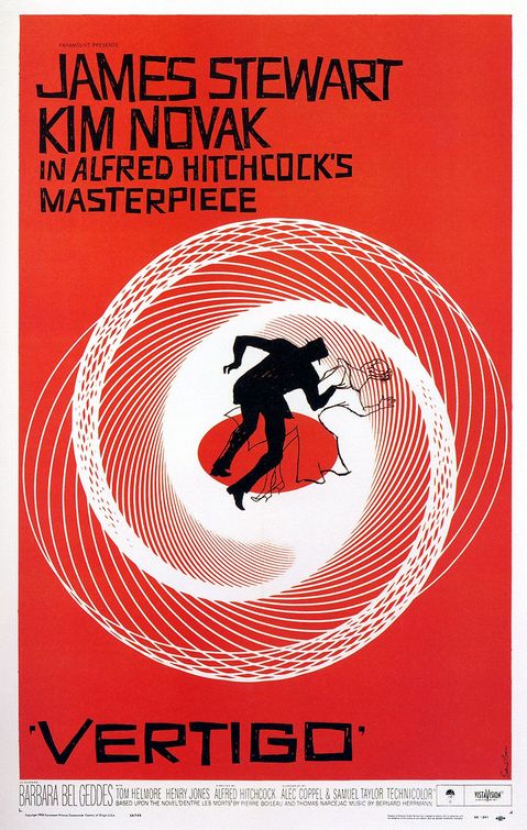
Designer Saul Bass was BIG a few decades ago (think Vertigo and the original AT&T logo) and his influence can still be found in book covers today. Here is a short video a design student worked up, imagining “what if Saul Bass had been tapped to do the now iconic Star Wars title sequence. I think the fonts and titles are spot on and “very Bass”. It’s all pretty cool (though I’m not sure about the music).
And I wish I could get it to embed, but we seem to be having problems, so you’ll have to click on through, if you want to watch. Sorry. Once there you’ll be able to see the other films Bass’s brush has been applied to.
If you don’t enjoy typography or type geekery discussion, please move along, there’s nothing to see here.
Since the Quills are no more, I am going to spend my “award show tracking energy” to keeping up with the Type Directors Club annual competition. I have to say that I am in 100% agreement with the Superfamily winners this year! Awesome. Though I’m not a fan of the Display category winner, but then display fonts never really rank that high with me. And I am really digging the lowercase ‘y’ of Fondo.
I am, however, going to have to find a way to justify purchasing Tiina, just so I can use the italic face. Mmmmm, mmmm… that is one great slant!
The USPS has long been cranking out stamps designed specifically for collectors. Now they are releasing some with a great eye for design. I have to agree with the Theorist that these Eames stamps are high on the want list!

