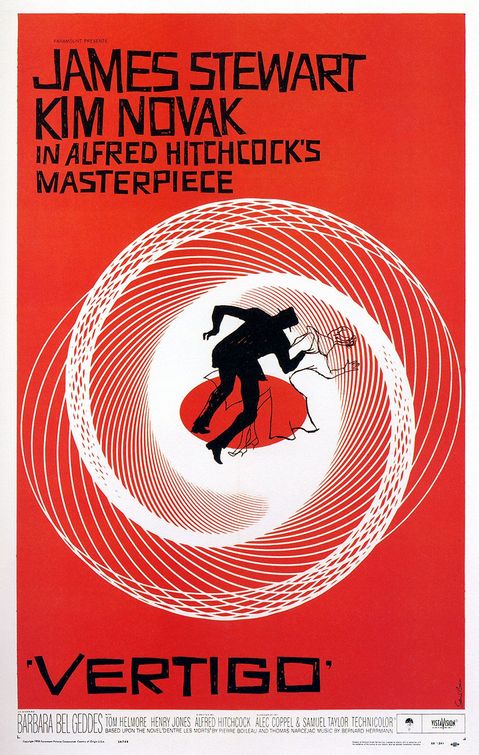
Just easing into the week with a fun Flickr collection rolling through on slideshow. It has almost 150 screenshots from various films and tv shows over the years. Lots of fun fonts. My favorite turned out to be this classic by Saul Bass.


Just easing into the week with a fun Flickr collection rolling through on slideshow. It has almost 150 screenshots from various films and tv shows over the years. Lots of fun fonts. My favorite turned out to be this classic by Saul Bass.
I saw this over the weekend and tried it out myself. It’s called Wordle and is a pretty neat way to get a stylish snapshot tag cloud of your own site. You get to control the fonts used and colors and have a little control over the layout. Who knew that I talked about banned books so much?

{hat tip goes out to ericlee.us}
Designer Saul Bass was BIG a few decades ago (think Vertigo and the original AT&T logo) and his influence can still be found in book covers today. Here is a short video a design student worked up, imagining “what if Saul Bass had been tapped to do the now iconic Star Wars title sequence. I think the fonts and titles are spot on and “very Bass”. It’s all pretty cool (though I’m not sure about the music).

And I wish I could get it to embed, but we seem to be having problems, so you’ll have to click on through, if you want to watch. Sorry. Once there you’ll be able to see the other films Bass’s brush has been applied to.
BookPatrol mentioned a cool archive this weekend that features 100 Years of Alphabet Books. I wish I had all the time in the world to go through and look at these. Some of the lettering is worthy of framing.
Over on BibliOdyssey, this weekend, a collection of over-the-top “holy smokes how long did it take them to make that back then” ornate letters and folios were posted. Some of the letters are so ornate that I wouldn’t know what letter it was if not for the tag line. I’ll remember this is how they used to do it, the next time I’m cussin’ a font designer for not setting the kerning correctly on a new display font and maybe it won’t seem so bad.